CIBC projects
This space is to showcase some of the smaller projects I have done in CIBC.
Project 1 - Adapta card category section
CIBC was launching a new credit card, and I was responsible for creating the reward hub page for this product. Since there was already an existing reward hub page, most elements were reused for this project. However, I had the opportunity to design a new top category section.
Some design iteration
Design iteration
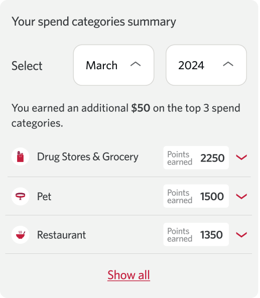
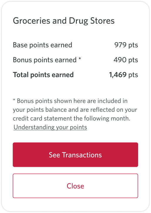
This section shows the points each client has earned for every category. The main feature of this new credit card is that clients earn extra points from their top three spending categories, so we wanted to highlight both the total points earned and the additional points received from the top three categories.
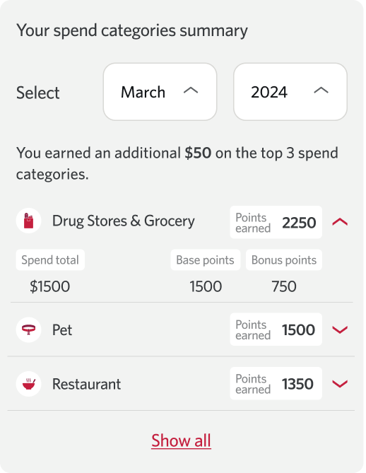
There are a total of 12 categories, but to keep the focus on where the client receives extra points, only the top three categories are displayed by default, with the remaining categories hidden. The initial idea was to display all data within the section. I explored several versions, including showing all points immediately and placing the details inside an accordion for easier navigation.
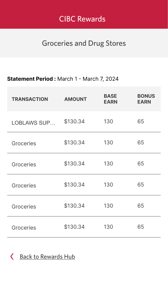
Ultimately, we determined that clients needed a space to review a detailed summary of their points, so we added a modal that leads to a dedicated detail page.
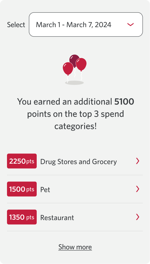
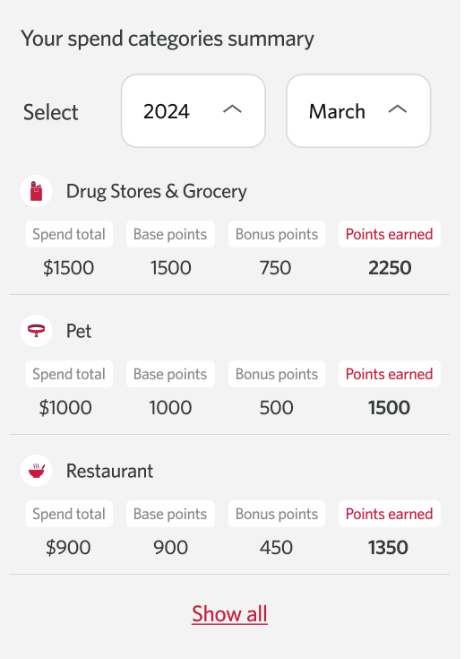
Final design
Conclusion
This design was well received by the CIBC team, and they ultimately obtained a patent for it. It was the first time one of my designs was patented, and it has become one of my favourite projects at CIBC. I am proud to share it in my portfolio.
Project 2 - Digital Identity Verification page redesign
The current digital identity verification (DIV) process requires clients to navigate through two separate pages before beginning verification. The option to verify in person is presented as an equal alternative, which may cause confusion about the recommended method. Additionally, information about the DIV process is repeated, and there is insufficient detail provided about the next steps in the verification journey.
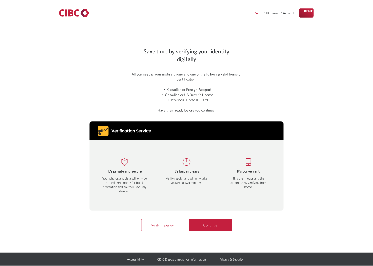
Old design (2 steps)
Old design analysis
During user testing conducted prior to this project, we identified several areas for improvement. First, some clients were confused about which steps would take place on the CIBC website versus the Interac website. There was also a misconception that only a photo of their identification was required for verification.
Solution
From user testing, I found that our current page does not give clients enough confidence to proceed with the digital identity verification (DIV) process. Our main target for this project was clients who are neutral about sharing identification online but are hesitant to continue with the CIBC DIV process.
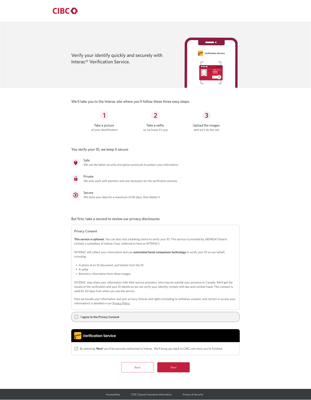
To help build their confidence, we decided to add more detailed information about the process, including what will happen if they proceed with DIV and transparent details about data usage and storage. Since many clients are familiar with the Interac brand and use it daily, I chose to display their logo more prominently to provide clients with additional reassurance.
In previous user testing, we received feedback that hesitant clients often leave the process to find more information elsewhere. To address this, I added an external link related to the DIV process so clients can find extra reassurance without leaving the page.
Finally, I added a modal that appears when clients select the proceed button, helping to prevent confusion about where they are in the process and what the next step will be.
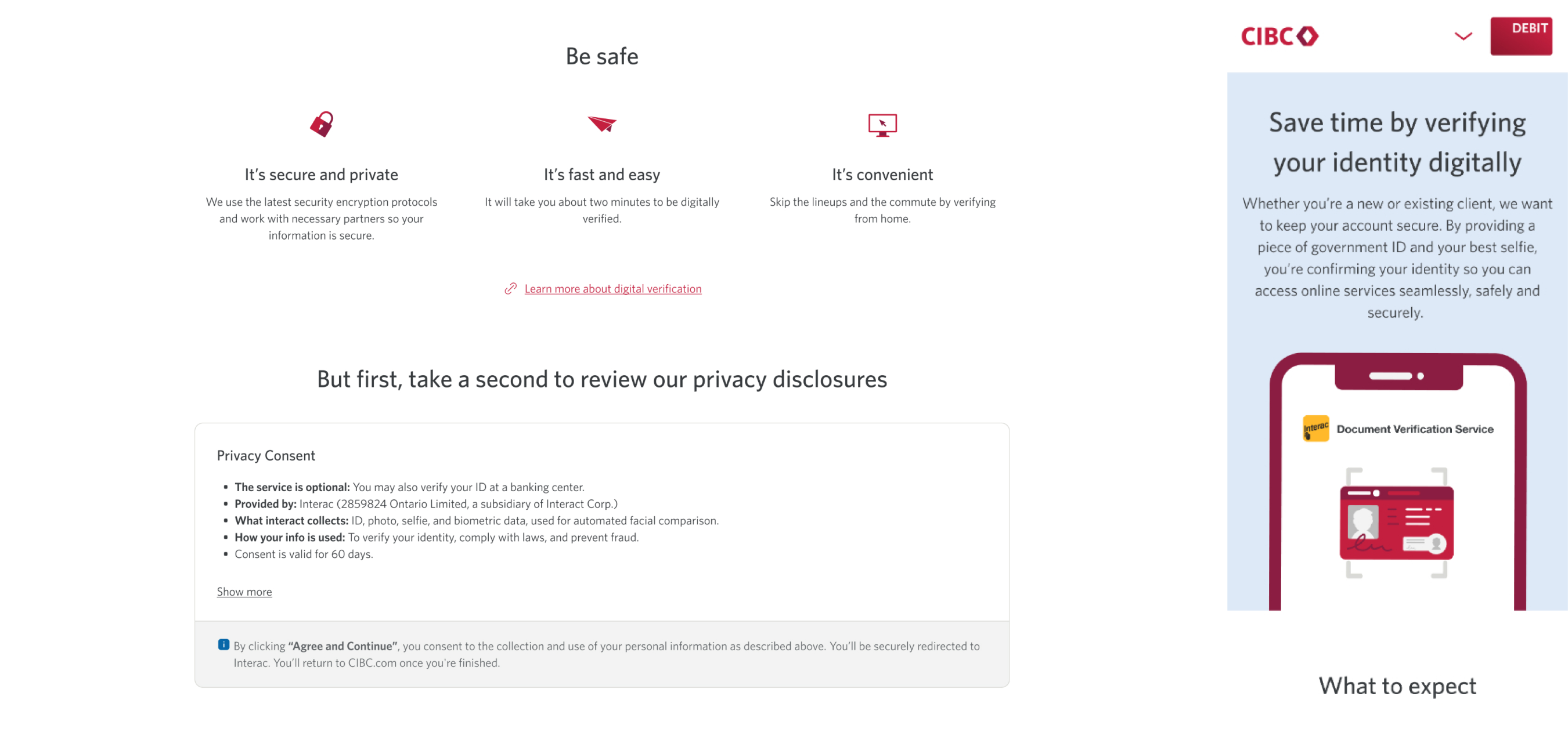
Final design
Final result
In our user research, most participants appreciated the transparency regarding the security and data storage protocols between CIBC and Interac, especially the clarity around how long information is stored. All participants indicated they would be likely to proceed with digital identity verification (DIV) based on the information presented in this experience. They felt the content on this screen was appropriate and provided the necessary details to guide their understanding of digital identity verification.
Although this project has not officially launched yet, I expect to see an improved DIV acceptance rate compared to before this redesign.